Flipping through my latest magazine find, I stumbled upon an article about one of my most-binged series this year—Apple Cider Vinegar’s star, Alycia Debnam-Carey. But it wasn’t just the words that held me. It was the colours.
Earthy, dusk-toned, effortlessly rich. A shade that felt like warm leather, strong coffee, the last light of golden hour. Deep, grounding, yet endlessly refined.
Some colours are fleeting—trendy for a moment, forgettable in the next. But this? This colour is timeless. It lingers, like the scent of cedarwood in a well-loved library, like the brush of linen against sun-warmed skin. It’s not just a colour—it’s a mood, a muse, a moment.
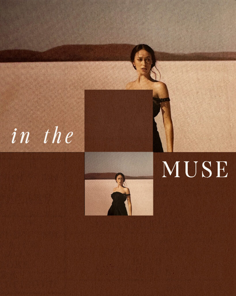
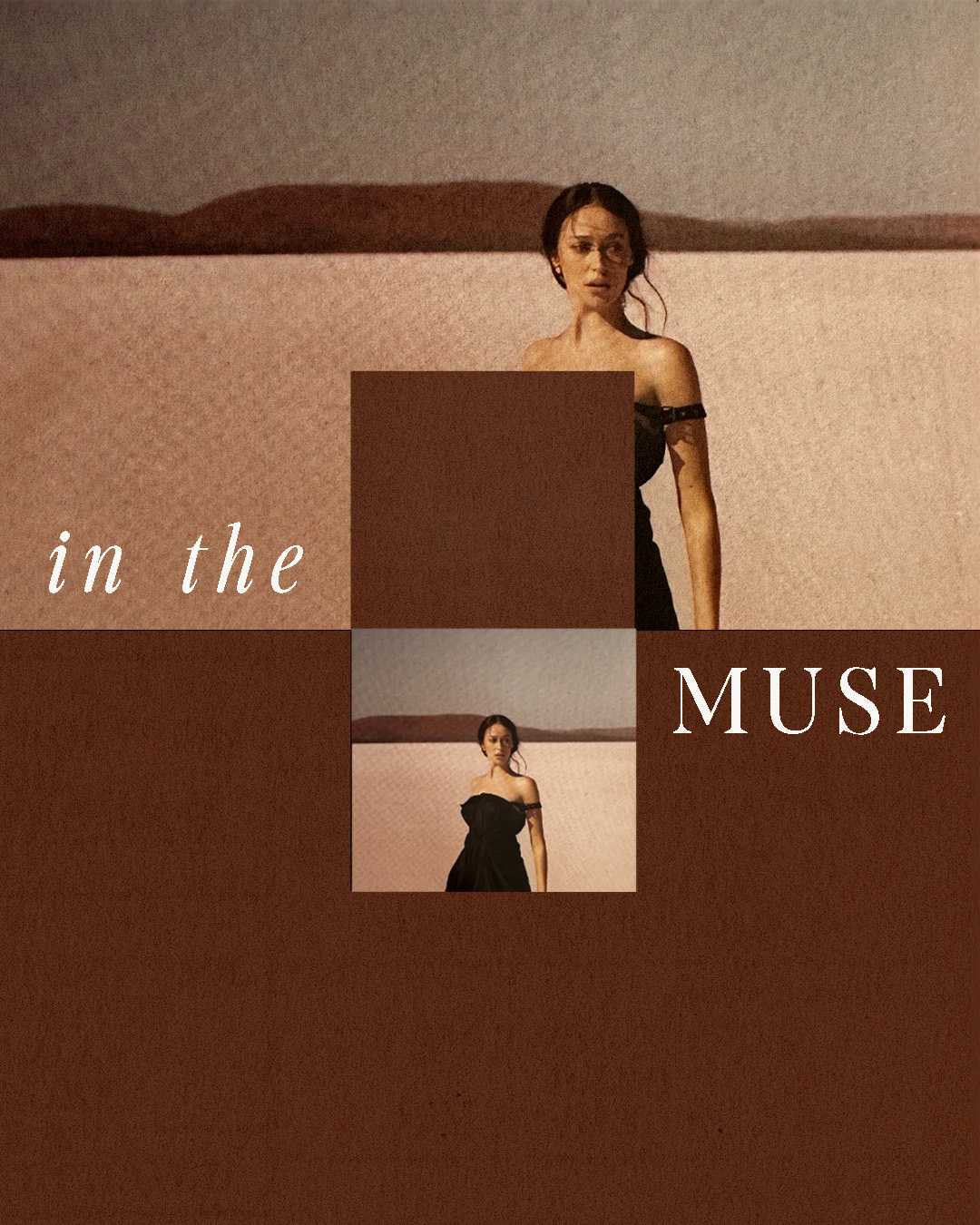
In the Muse
There’s something cinematic about this shade. It belongs to the pages of an old journal, to the endless stretch of desert at dusk, to the kind of evening that demands deep conversation and candlelight. It’s rich but understated, bold but never loud.
This image sets the tone—subtle, captivating, steeped in emotion. There’s an effortless strength in the contrast of deep brown against soft neutrals. It doesn’t need to shout to be seen. It just is.
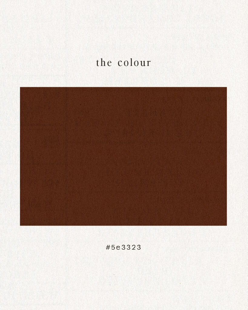
The Colour
Hex code #5e3323. A brown with presence. A shade that doesn’t just exist—it tells a story.
It’s the colour of aged oak, of espresso kissed with cinnamon, of well-worn boots that carry their own history. It’s depth and warmth in one, a grounding force that instantly brings balance.
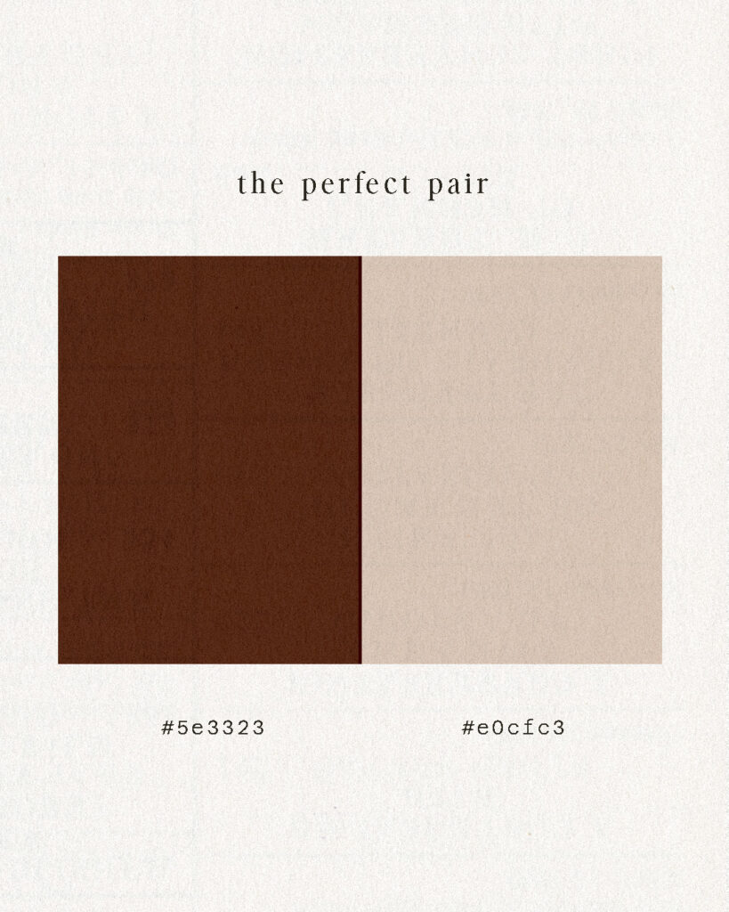
The Perfect Pair
There’s something about pairing a strong, earthy tone with a soft neutral that feels like alchemy. Together, #5e3323 and #e0cfc3 create a palette that speaks of quiet luxury.
It’s the sun-drenched linen against rich walnut, the warmth of terracotta softened by cream. It’s contrast done right—balancing richness with restraint, making both shades feel even more intentional.
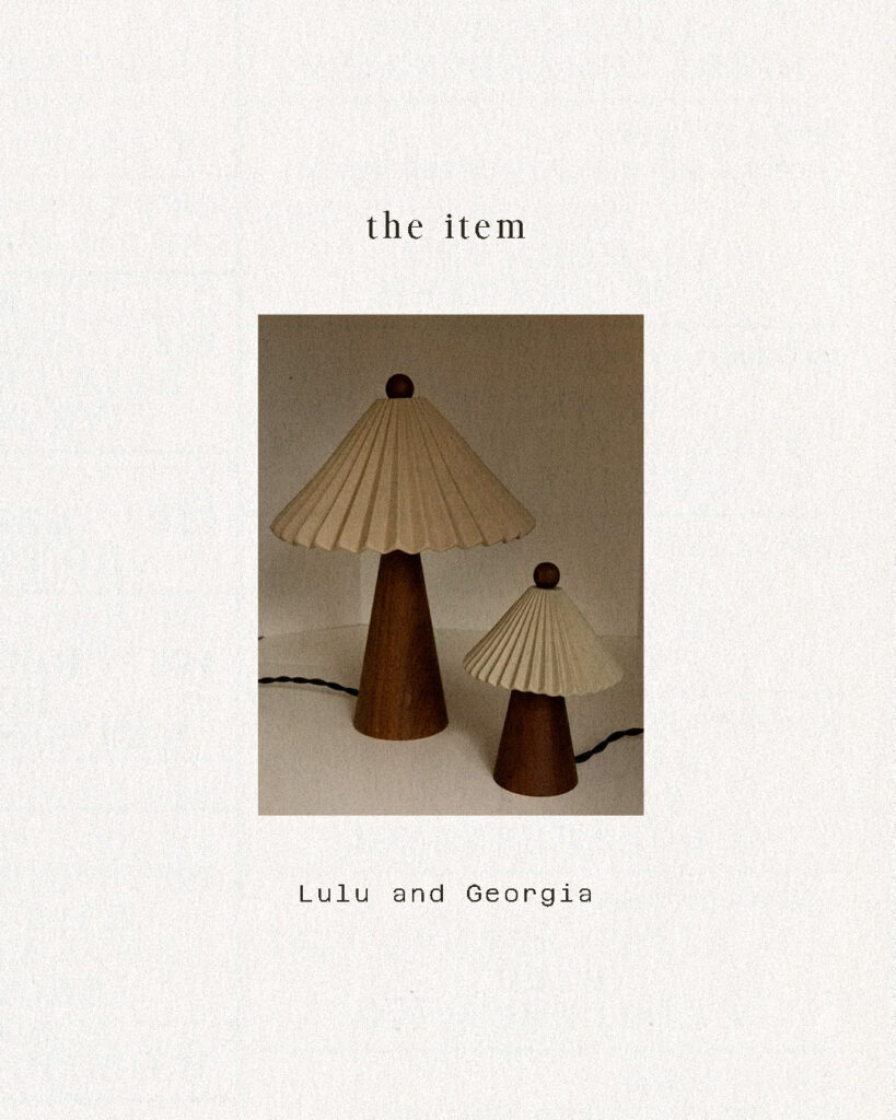
The Item
A space is only as strong as its details. This lamp set—textured, sculptural, refined—captures the essence of the colour perfectly. The deep wood base mirrors the warmth of #5e3323, while the pleated shade brings in lightness, movement, and an organic softness.
Placed in a room, it’s the kind of object that makes everything else feel more considered. The kind of design choice that makes a space feel finished.
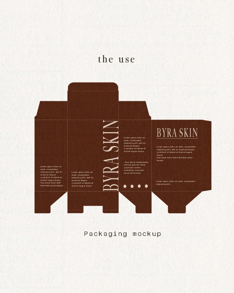
The Use
On packaging, this colour speaks of craftsmanship and intention. It’s the kind of shade that makes a product feel premium, that adds an unspoken layer of trust. It doesn’t beg for attention, but it holds its own. It’s classic, effortless, a whisper of quiet confidence.
The mock-up is proof of its power—rich but not overpowering, elegant but not trying too hard. The kind of branding that feels instantly established.
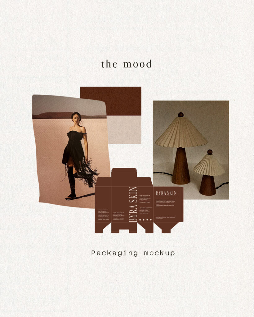
The Mood
This isn’t just a colour—it’s a feeling. A palette that turns design into emotion. That transforms a space, a brand, a moment into something felt.
Some colours exist for seasons. This one exists forever.


