Not every font pairing feels effortless—but when it does, it’s like finding the perfect balance between old and new, structure and softness.
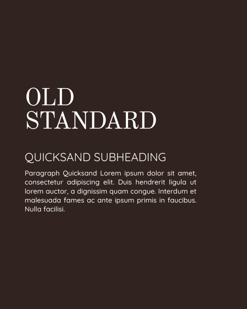
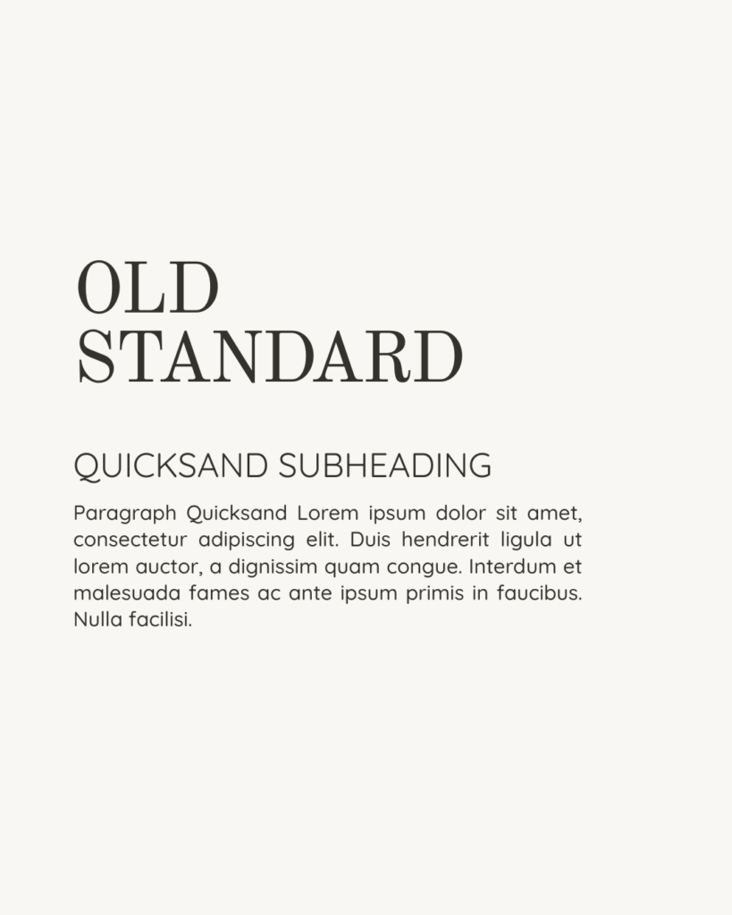
There’s a quiet kind of magic that happens when two fonts speak in contrast yet complement one another. This is exactly why I love the pairing of Old Standard and Quicksand—it’s classic, confident, but still completely approachable.
Let’s break it down.
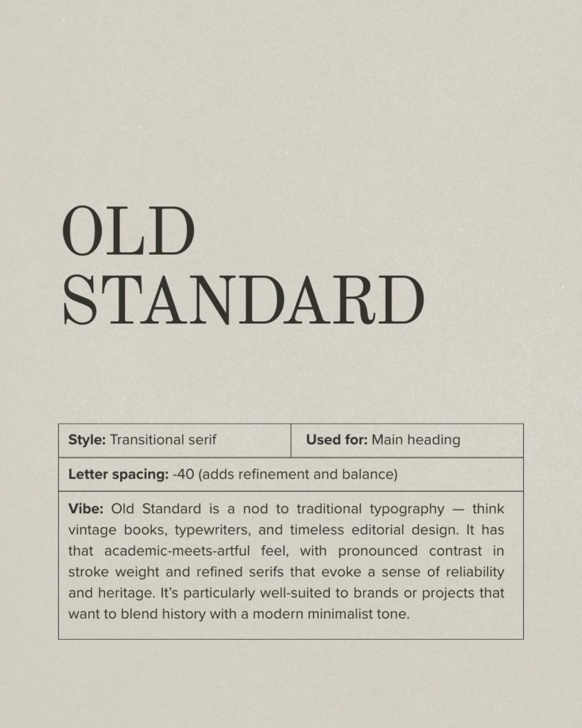
Old Standard: Editorial, Heritage, Timeless
Old Standard speaks in a voice from the past. Think vintage books, quiet libraries, the tap of typewriter keys. There’s a weight to it—both literally and emotionally—that feels grounded, considered, and thoughtful.
It has a distinct editorial charm. A serif that doesn’t scream for attention but holds it with ease. It’s formal, but never cold. Structured, but not stiff.
This is the kind of font that brings history into a modern brand space. It’s ideal for brands that want to feel rooted, trustworthy, and a little more thoughtful. If your brand is slow, intentional, or leans on storytelling—Old Standard holds space for that beautifully.
👉 Use it for:
Main headings, product names, logo wordmarks, editorial content
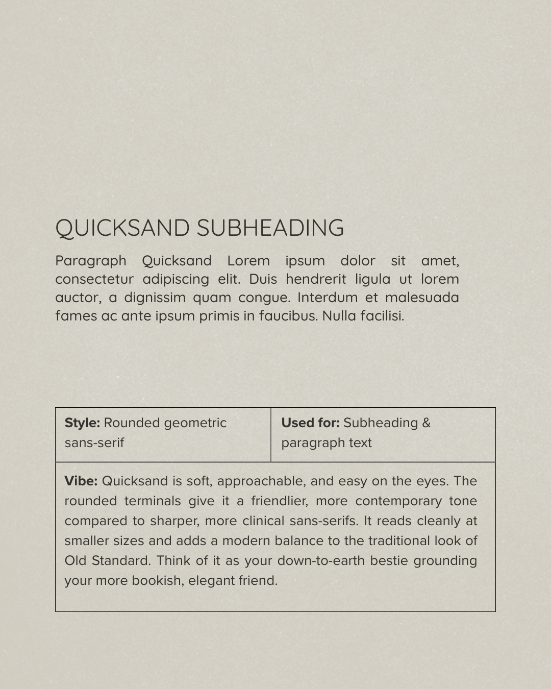
Quicksand: Friendly, Clean, Approachable
And then Quicksand walks in—with its rounded edges and friendly tone—and shifts the mood completely.
It’s light, soft, and modern. The kind of font that brings ease to a message. It’s particularly useful for brands that want to stay stylish and minimal, but not come across as too sharp or clinical.
Quicksand brings that human warmth. It offsets the formality of Old Standard with accessibility—like the grounded, smiley best friend who makes everyone feel welcome.
👉 Use it for:
Subheadings, body copy, captions, website paragraphs

Why They Work So Well Together
This pairing is built on what great brand storytelling thrives on: contrast and clarity.
👉 Contrast in tone: Old Standard gives formality and heritage; Quicksand brings friendliness and legibility
👉 Visual hierarchy: The bold serif catches your eye, the sans-serif keeps you reading
👉 Balance: You get the elegance of tradition and the freshness of modern design—without either overpowering the other
They work because they don’t try to match—they try to balance.
Alternatives You Can Try
Want to try something similar with a slightly different personality? Here are a few font swaps you can explore, depending on your brand’s tone:
If you love Old Standard but want a softer serif:
- Playfair Display (more romantic)
- Cormorant Garamond (more classic, refined)
- Libre Baskerville (subtler, more bookish)
If you love Quicksand but want something a little more editorial:
- Poppins (structured, modern)
- DM Sans (sleek but warm)
- Manrope (neutral and highly readable)
These fonts are all available in Canva or Google Fonts—so whether you’re working with a DIY kit or building something from scratch, they’re easy to test and implement.
Final Thoughts: Branding Through Typography
Choosing fonts is more than a design decision—it’s a storytelling one.
Your typography is one of the first things people feel when they land on your brand. It communicates tone, personality, and intention before you’ve written a single word.
Old Standard + Quicksand is more than just a pairing. It’s a conversation between structure and soul. One draws you in with depth; the other invites you to stay.
And just like the best brands—it’s not about being loud. It’s about being aligned.