
Your brand is whispering when it should be making an entrance. It’s showing up in last season’s leftovers while your dream clients are craving a front-row moment.
Branding isn’t just about looking pretty—it’s about being undeniable. The kind of presence that makes people stop scrolling, lean in, and think, Damn, I need this in my life.
But let’s be real—DIY branding can feel like a bad relationship. One day, you’re obsessed. The next, you’re questioning every font choice, drowning in 47 slightly different shades of beige, and wondering why your website still doesn’t give the energy you’re chasing.
Here’s the truth: brand designers have tricks. And they don’t always share them.
✨ The typography sorcery that makes a brand feel instantly high-end.
✨ Where to find fonts that don’t scream “default Canva selection.”
✨ How to pick stock imagery that looks effortless—not like it came from a corporate brochure in 2007.
Your brand should feel like a love letter to your business—bold, intentional, and impossible to ignore. And lucky for you, I’m spilling all the secrets.
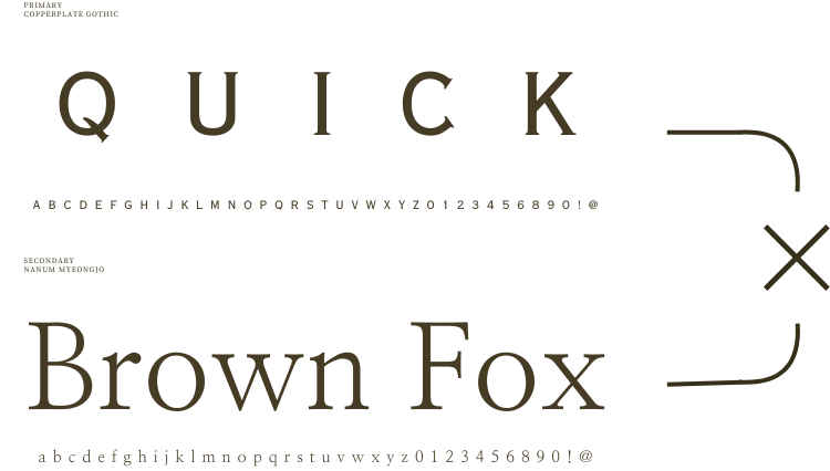
Typography Pairing Secrets
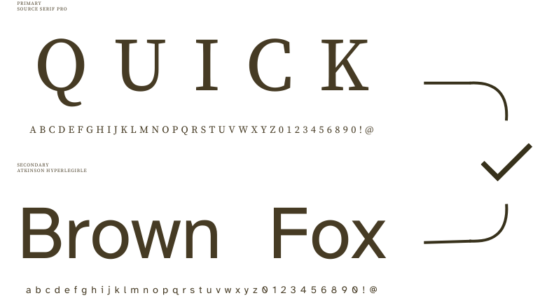
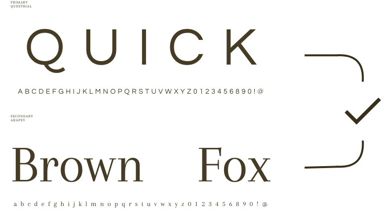
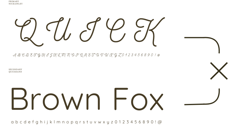
Typography is one of the quickest ways to elevate or cheapen a brand. It’s subtle, but powerful. A brand with perfectly paired fonts looks polished and premium, while mismatched or overused fonts can make even the best-designed website feel amateur.
Here’s what brand designers won’t always tell you:
• Contrast is key – Pairing a bold, statement typeface with a clean, minimal font creates hierarchy and balance. For example, a modern serif header with a sleek sans-serif body text.
• Avoid ‘cousin’ fonts – Two fonts that are almost the same can feel like a mistake rather than an intentional choice. The key is contrast, not competition.
• Think about personality – Fonts carry emotion. A playful, handwritten font won’t pair well with a rigid, corporate sans-serif. Your fonts should align with the overall feel of your brand.
• Stick to two, max three – Too many fonts = chaos. A strong header, a subheading font, and a readable body text font are all you need.
• Test for readability – Some fonts look stunning at large sizes but become illegible as body text. If people can’t read your website without squinting, they won’t stay.
Premium Font Sources
Many designers push Google Fonts as a budget-friendly option (and they’re fine in a pinch), but if you want a truly distinctive brand, premium fonts are where the magic happens.
Here’s where designers actually get their high-end fonts:
• Creative Market – A goldmine for unique, handcrafted fonts that feel more bespoke.
• MyFonts – One of the largest font libraries, featuring exclusive typefaces that can instantly elevate a brand.
• Adobe Fonts – Included with an Adobe subscription, offering high-quality, professional fonts.
• Fontspring – A great source for independent foundries with well-crafted typefaces. No subscriptions—just one-time purchases.
• The Secret Sauce: Custom Typography – Many designers actually tweak existing fonts or create custom lettering to make a brand truly unique. That’s why high-end brands feel perfectly aligned—because their typography isn’t off-the-shelf. [Like me!]
Stock Image Curation
Here’s something most people don’t realise: the wrong stock images can instantly cheapen a brand. A high-end website with low-quality, stiff-looking stock photos? A branding disaster.
One of the biggest secrets in branding is knowing where (and how) to find stock images that don’t look like stock images.
Here’s how designers curate stunning, on-brand imagery:
• Look beyond free stock sites – While Unsplash and Pexels are great for DIYers, they’re overused. Paid stock sites like Stocksy and Death to Stock offer less recognisable, high-quality images.
• Search with emotion, not objects – Instead of searching “woman at laptop,” try “moody workspace” or “warm branding aesthetic” to get more natural, lifestyle-driven imagery.
• Use image colour filters – Many stock sites allow you to filter by colour. If your brand palette is warm neutrals, filter your search for beige, cream, and warm tones for instant cohesion.
• Avoid ‘too perfect’ stock photos – The ones with forced smiles and stiff poses scream stock. Instead, look for candid, lifestyle imagery that feels real.
• Create custom edits – Even the best stock photos can feel impersonal. Designers often apply overlays, grain, or subtle colour tweaks to make them align with a brand’s aesthetic.
Bringing It All Together
Brand designers don’t just design—they curate. They refine. They know exactly how to pull together fonts, colours, imagery, and layouts to create a brand that feels effortlessly premium.
But here’s the thing: You don’t need to be a designer to make your brand feel polished.
You just need to know what to look for, what to avoid, and how to curate branding elements with intention.
No more fonts that feel off. No more stock photos that scream awkward corporate handshake. No more staring at your website wondering why it just doesn’t feel right.
Your brand deserves better. And now? You know exactly where to start.
